
Today I worked on improving the accessibility of the travel budget planning React app I have been building. I usually code with accessibility in mind to some extent when it comes to some of the more obvious things, like using semantic html elements (like headers, buttons, links, etc. instead of divs) and logical html and tab order, but my app still had room for improvement. In this post I will walk through some of the updates I made to improve accessibility.
There are two main pages in the app that I am using to demonstrate the issues and changes. Please note that there are other pages and I went through each one, audited them, and fixed any issues.
The Problems
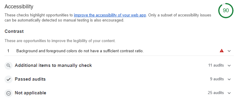
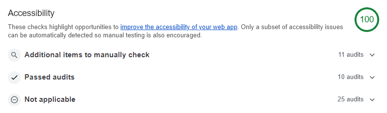
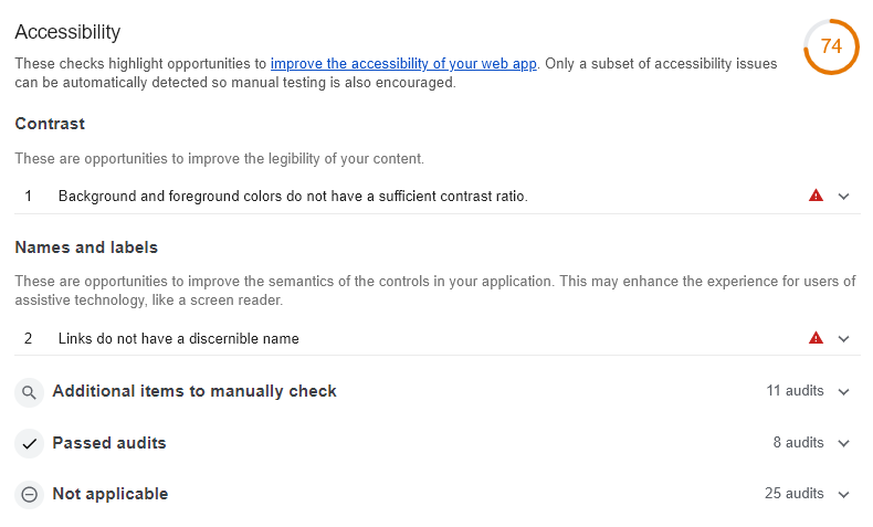 Before the changes, the Lighthouse accessibility score was at 90 on the Dashboard page and even lower at 74 on the Trip page.
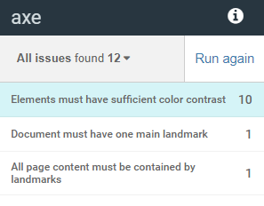
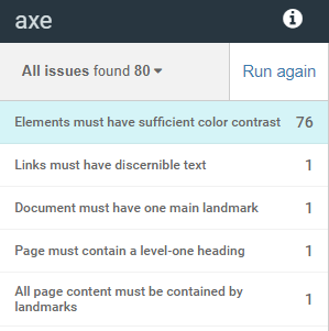 I also ran the aXe plugin to check for issues. On the Dashboard page it found 12 issues, and 80 issues on the Trip page (most related and having to do with contrast).
I also tested manually by tabbing through the pages looking for unclear focus or unfocusable interactive elements, and regions that could trap a user.
After I found the issues, I got started on the fixes.
The Solutions
Improving Color Contrast
The teal green color I was using did not have enough contrast as a background with white text. I changed the teal green color to a dark, almost forest green color to improve the contrast between the white foreground text and the darker background for buttons. I changed the light minty green background I was using as a secondary color in the header bar to a lighter silver gray to improve the contrast of the dark gray text over the header background.
I also had some captions over the Unsplash images with the photo attributions that were white text over a dark gray background but with an opacity of 0.7 for the element. I changed the opacity to 100% to fix the contrast issue.
Finally, I had meters for the budgets with text overlayed over the meter, which was white when the meter was empty, and the empty meter had a light gray background. To handle this issue, I re-designed the meters. I removed the overlayed text and moved the text outside of the meter. Since that space was previously being used by Edit and View Expenses links in some areas where the meters were being used, I changed up the design to add the edit link as an edit icon button to the right of the meter, and made the header above the meter clickable to View Expenses. I'm not too happy with the last point since the clickable region does not look like a link or a button, so the UX here isn't great. I will likely be re-designing this in the future to improve the UX.
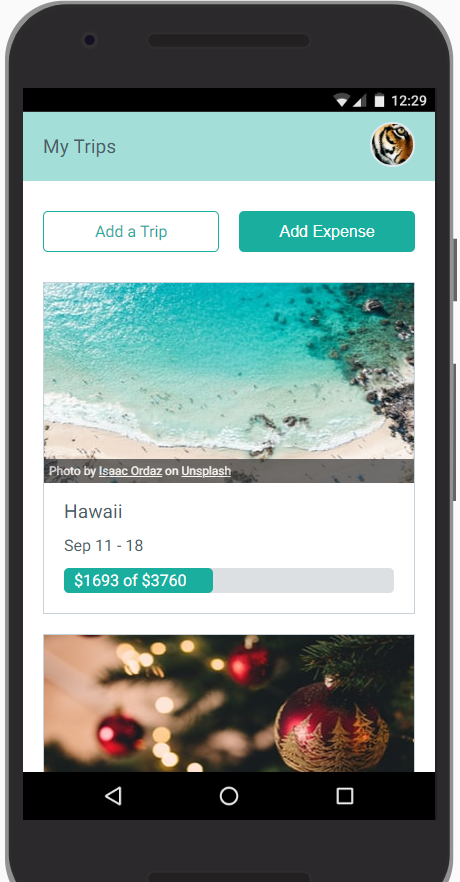
This is how the dashboard looked before the changes.
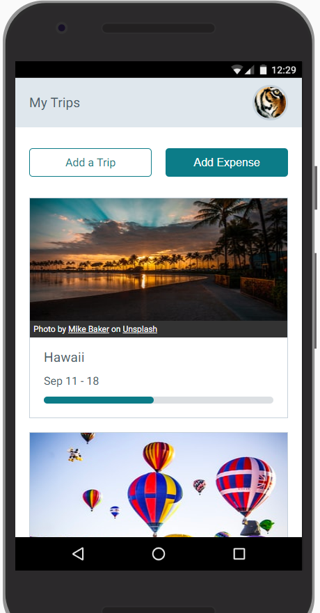
And this is how the dashboard looked after the changes.
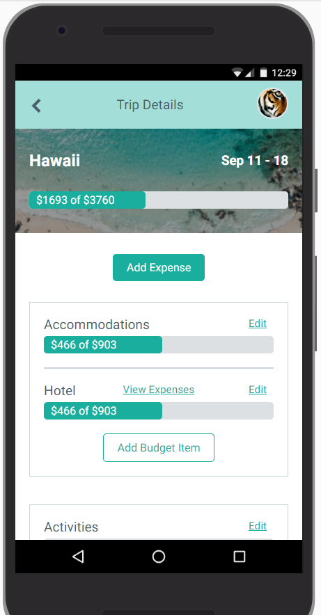
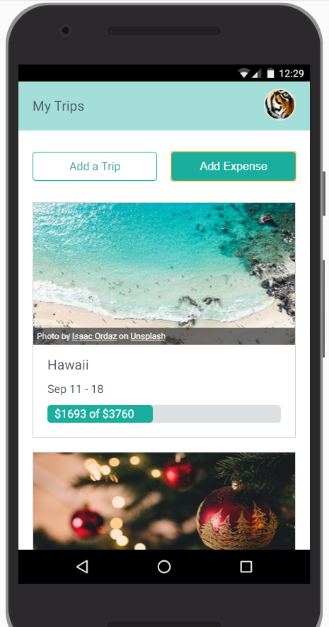
This is how the trip page looked before the changes.
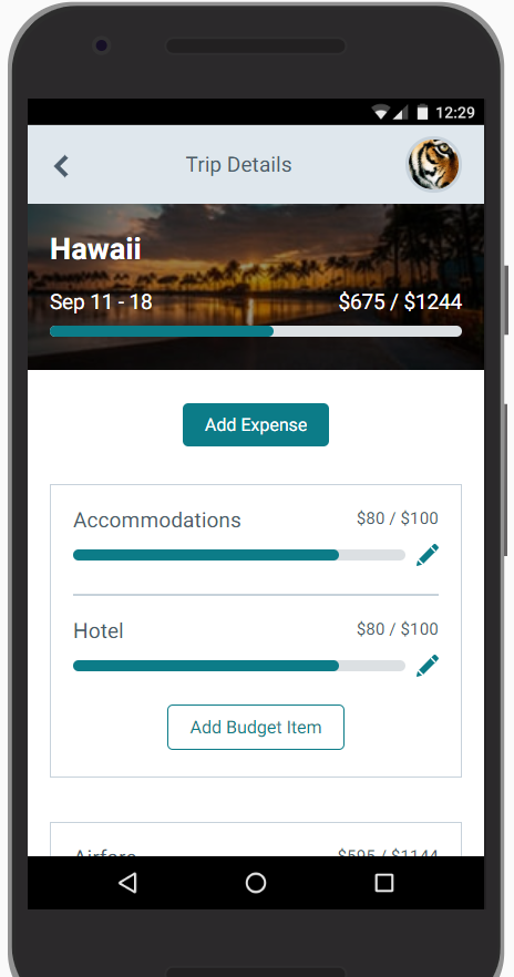
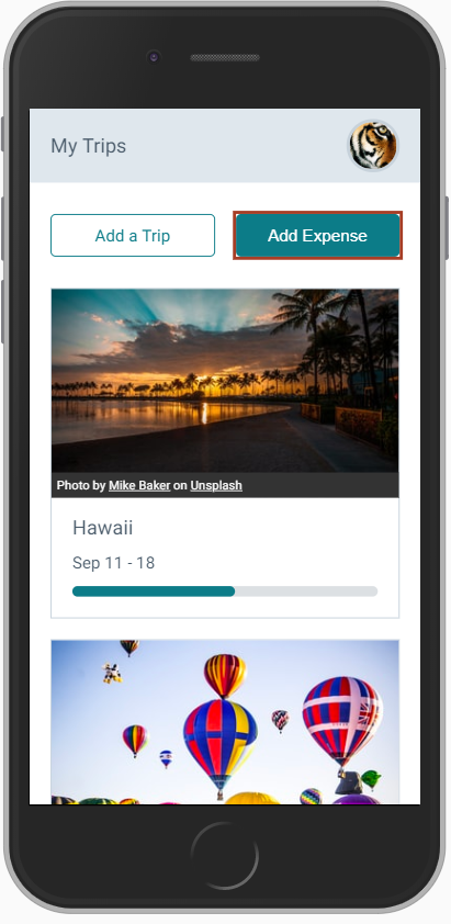
And this is how the trip page looked after the changes.
I think one of the hardest things about accessibility for designers is being ok with the constraints of accessible palettes. Not all colors are going to work if you want an app or website to be accessible. You can't both want to deliver accessible apps but also be married to certain color combinations. Or in the case of the figure captions, I can't want them to be subtle but also unreadable to a certain subset of the audience. Designing with accessibility as a priority means putting acessibility first and "design aesthetics" second.
Fix tabbing
The first issue I found tabbing through the site was that the profile photo that opens a menu with the Sign Out link was not focusable at all. The Sign Out link was completely inaccessible for tabbing. I fixed this issue by adding a button element around the profile photo that would open the menu on click instead of the div I had been using.
The second issue I found was that when opening the Add Expense modal on the dashboard, there was no way to get out of it once I was in it except for the Esc key. I had used the react-modal library which is actually really good with accessibility, and the Esc key is a good escape hatch, but I went ahead and improved upon that by adding a Cancel button to make it really clear how to get out of the modal.
Third, I noticed that the default browser outline for the focus state of buttons and elements didn't seem to stand out that well, especially on the dark primary buttons and the links in the figure captions. I added a 3px border for the focus state of link and button elements in a different color.
This is an example of how a focused button appeared before the changes.
And this is how a focused button appears after the changes.
Links must have discernible text
The back button I had as well as the previously mentioned profile photo button didn't have any text associated with them, only icons. I added aria-labels to each of them to fix this issue.
Document must have one main landmark
For this issue, I simply changed the highest level div in my React app to a <main> element.
Page must contain a level-one heading
I had been using a div for the page header in the navigation bar, so I changed it to an <h1> element. I had already been using h2 and h3 elements in the app and no h1, so it was a natural change to make.
The Result
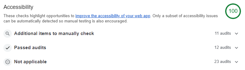
After the changes, the Lighthouse score went from 90 to 100 on the Dashboard page and 74 to 100 on the Trip page.
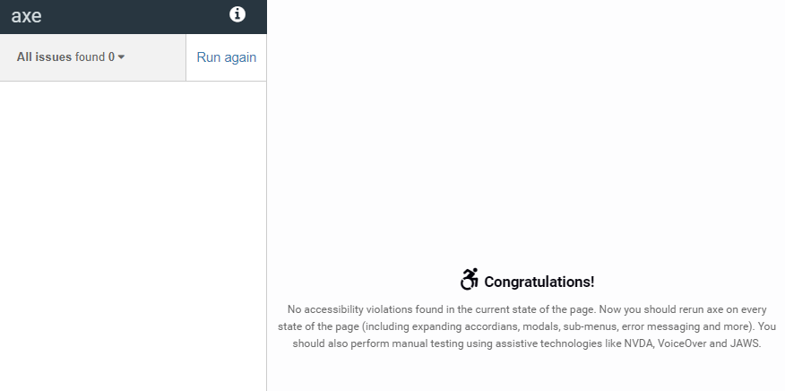
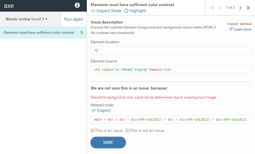
The number of reported issues with aXe went from 12 to 0 on the Dashboard page and 80 to 3 potential issues on the Trip page. Those three issues are related to the text over the image on the Trip page where aXe can't determine if the contrast is high enough. Since the image varies depending on destination, there may be cases where the contrast is not high enough, so ideally I would re-design this part of the Trip header.
I hope this is helpful to anyone else trying to improve the accessibility of their app or website. This is not a comprehensive list of issues you may run into, but if any of these apply to your current or future project, I hope this post will be helpful. Please feel free to ask questions or provide feedback in the comments below!

Share
Think others might enjoy this post? Share it!
Comments
I'd love to hear from you, let me know your thoughts!